


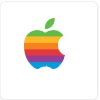
Today i am sharing some code which help to create Old Apple Logo.
HTML Part
HTML Part
Html Form the base of the entire logo, and the entire magic come from css3.<html>
<head>
<title> Apple Logo With CSS3 </title>
</head>
<body>
<p id=”apple”>
<span id=”heta”></span>
<span id=”bodyL”></span>
<span id=”bodyR”></span>
<span id=”hole”></span>
<span id=”bottomL”></span>
<span id=”bottomC”></span>
<span id=”bottomR”></span>
</p>
</body>
</html>
CSS3 Part
body{
          background:rgba(255, 255, 255, 1);
        }
        span{display:block;}
        #apple{
          width:200px;
          height:200px;
          border:1px solid #e6e6e6;
          border-radius:10px;
          -o-border-radius:10px;
          -moz-border-radius:10px;
          -webkit-border-radius:10px;
          box-shadow:0 2px 4px rgba(214, 214, 214, 0.6);
          -moz-box-shadow:0 2px 4px rgba(214, 214, 214, 0.6);
          -webkit-box-shadow:0 2px 4px rgba(214, 214, 214, 0.6);
        }
        #heta{
          position:absolute;
          top:50px;
          left:101px;
          width:20px;
          height:23px;
          background-color: #61BB46;
          border-radius:80px 0 80px 0;
          -o-border-radius:80px 0 80px 0;
          -moz-border-radius:80px 0 80px 0;
          -webkit-border-radius:80px 0 80px 0;
        }
        #bodyL{
          position:absolute;
          top:75px;
          left:58px;
          width:54px;
          height:88px;
          background-image: -moz-linear-gradient(
            top,
            #61BB46 0%,
            #61BB46 15%,
            #FDB827 15%,
            #FDB827 30%,
            #F5821F 30%,
            #F5821F 45%,
            #E03A3E 45%,
            #E03A3E 60%,
            #963D97 60%,
            #963D97 75%,
            #009DDC 75%,
            #009DDC 100%
          );
          background-image: -webkit-gradient(
            linear,
            left top,
            left bottom,
            color-stop(0%, #61BB46),
            color-stop(15%, #61BB46),
            color-stop(15%, #FDB827),
            color-stop(30%, #FDB827),
            color-stop(30%, #F5821F),
            color-stop(45%, #F5821F),
            color-stop(45%, #E03A3E),
            color-stop(60%, #E03A3E),
            color-stop(60%, #963D97),
            color-stop(75%, #963D97),
            color-stop(75%, #009DDC),
            color-stop(100%, #009DDC)
          );
          border-radius:56px 56px 0px 108px;
          -o-border-radius:56px 56px 0px 108px;
          -moz-border-radius:56px 56px 0px 108px;
          -webkit-border-radius:56px 56px 0px 108px;
        }
        #bodyR{
          position:absolute;
          top:75px;
          left:89px;
          width:54px;
          height:88px;
          background-image: -moz-linear-gradient(
            top,
            #61BB46 0%,
            #61BB46 15%,
            #FDB827 15%,
            #FDB827 30%,
            #F5821F 30%,
            #F5821F 45%,
            #E03A3E 45%,
            #E03A3E 60%,
            #963D97 60%,
            #963D97 75%,
            #009DDC 75%,
            #009DDC 100%
          );
          background-image: -webkit-gradient(
            linear,
            left top,
            left bottom,
            color-stop(0%, #61BB46),
            color-stop(15%, #61BB46),
            color-stop(15%, #FDB827),
            color-stop(30%, #FDB827),
            color-stop(30%, #F5821F),
            color-stop(45%, #F5821F),
            color-stop(45%, #E03A3E),
            color-stop(60%, #E03A3E),
            color-stop(60%, #963D97),
            color-stop(75%, #963D97),
            color-stop(75%, #009DDC),
            color-stop(100%, #009DDC)
          );
          border-raidus:52px 42px 78px 0;
          -o-border-radius:52px 42px 78px 0;
          -moz-border-radius:52px 42px 78px 0;
          -webkit-border-radius:52px 42px 78px 0;
        }
        #bodyT{
          position:absolute;
          top:80px;
          left:100px;
          width:3px;
          height:2px;
          background:rgba(57, 58, 61, 0.8);
          -webkit-border-radius:1px;
        }
        #hole{
          position:absolute;
          top:84px;
          left:128px;
          width:42px;
          height:44px;
          background:rgba(255, 255, 255, 1);
          border-radius:21px 20px 20px 21px;
          -o-border-radius:21px 20px 20px 21px;
          -moz-border-radius:21px 20px 20px 21px;
          -webkit-border-radius:21px 20px 20px 21px;
        }
        #bottomL{
          position:absolute;
          top:115px;
          left:65px;
          width:30px;
          height:40px;
          border-bottom:3px solid rgba(255, 255, 255, 1);
          border-radius:0 0 16px 46px;
          -o-border-radius:0 0 16px 46px;
          -moz-border-radius:0 0 16px 46px;
          -webkit-border-radius:0 0 16px 46px;
        }
        #bottomC{
          position:absolute;
          top:150px;
          left:81px;
          width:42px;
          height:40px;
          background:rgba(255, 255, 255, 1);
          border-radius:20px;
          -o-border-radius:20px;
          -moz-border-radius:20px;
          -webkit-border-radius:20px;
        }
        #bottomR{
          position:absolute;
          top:115px;
          left:103px;
          width:30px;
          height:40px;
          border-bottom:3px solid rgba(255, 255, 255, 1);
          border-radius:0 0 26px 24px;
          -o-border-radius:0 0 26px 24px;
          -moz-border-radius:0 0 26px 24px;
          -webkit-border-radius:0 0 18px 24px;
        }
 |
About Editorial Staff Nathan Shri is a Web Developer ,Opensource lover,and the editor of the codingwoo based in India ,who loves to learn new stuffs and and share.You can be his friend on Facebook. |